I have a strange problem with the use of image files to the timeline. In the screenshot below you can see the problem clearly. Project setting is 1080/25i, the image is 1920 x 1080 px and 8bit. The white background is a light gray, black and red is not fully saturated. Scaling is 100%. Time Line is rendered (; only necessary for the PSD file). Habs synonymous with other file formats try provides always crap! Also strange that the differences between the artifacts in PSD and JPG ...
Did not make that something trivial, such Manderl!
What am I doing wrong?
Thank you in advance for your help!
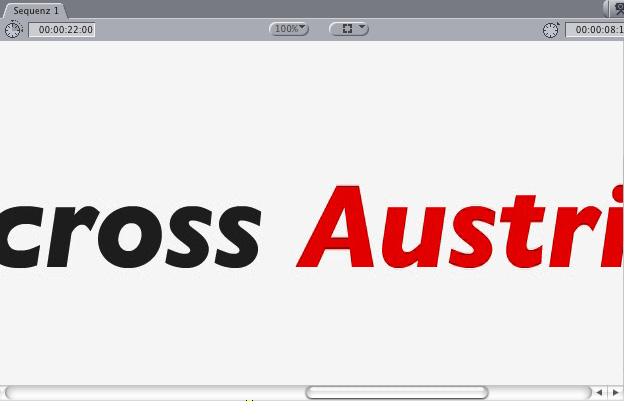
Here is the original:
This is the PSD file (; text not rendered) in 100% Canvas:
This is the JPG file (; text not rendered) in 100% Canvas:
Antwort von Axel:
I am not clear what this means, text not rendered, especially in a Jpeg. Well, the most innocent explanation is that you, if it is not rendered, something will get displayed in preview quality, which when it is rendered no more stains.
On my calibrated monitor shows the complex of you as "original" called Austri - Font cherry red, slightly yellow, the imported tomatoes from Holland on the other hand see things like, watery crimson. Interlace artifacts (stair edges, not suitable format for a progressive output device such as a computer for graphics really always appropriate).
Photoshop using a different color space. Apple used earlier (before Snowleo) another Gamma. Video (YUV) uses a different color space than your monitor (RGB). Your Calculator is working progressively, probably with 60 Hz refresh rate, your video is mince half & half, 50 Hz
What can you do acutely? Use the Film & Video preset in Photoshop. Use a smoothing filter, a slight blur (Alias | Wavefront Mayaing are toilet-germs, blur the chlorine cleaner against it). Do the writings s.besten same in FCE, the system program, Font Book, you can all synonymous for free fonts on the net, unlock for all Programs.
Calibrate your monitor (System Preferences> Displays) to 6500K and gamma 2.2 will look very strange. Rendering Color Bars (Color bars should be, if it is found as with Final Cut Pro, in the Effects tab in the browser) and then googel how to calibrate a monitor with them.
check reading in the help to ColorSync utility, let color profiles and repair if necessary.
Antwort von Jott:
Which codec? fce not professional codec has s.Bord, which will look forever. Red writing was and is hell, for various reasons - that's what you have is all right. As Good As It is at best completely uncompressed.
Antwort von Dexter Paris:
is @ Axel: "Text not not rendered" in the JPG, of course, cheese, comes from Copy'n'Paste ...
@ Jott: Apple Intermediate Codec is due to FCE. Since you will not even use "fully saturated colors," I know. That red is particularly vulnerable, which I did not know yet! Unfortunately, my logo is red ...
Do you tip a link where I can read more about the correct use of colors (the movie)?
I will now make time tests with text in other colors and see how the behavior then. I am just surprised the black artifacts! And yes, the black font looks OK ...
Antwort von Axel:
"Dexter Paris" wrote:
Do you tip a link where I can read more about the correct use of colors (the movie)?
How Jott says: There are worse things. When you begin, you deal with color spaces to seriously, you will tend unhappy. You see the grass grow and other weird things. If you had one - just as eternal convergence to be achieved - neutral monitor!
"Dexter Paris" wrote:
I will now make time tests with text in other colors and see how the behavior then. I am just surprised the black artifacts! And yes, the black font looks OK ...
General video graphics are problematic, especially if they have to be rendered in 8-bit, read the . The pure 8-bit solution to such - in principle, to accurate - color values in the font rounded edges, as already stated, a low-dose smoothing (blurring). Do you have it - again, especially with graphics - with color and brightness gradients do, look, the more violent. Then help a dither filter white (unfortunately not, as he says in FCE). What he does is to roughen a smooth course "," principle is here: http://de.wikipedia.org/wiki/Dithering_ (Image editing) clearly made (Link nit funzt). A pixel can only be one color and brightness value, have the contours of your bright red letters against a light gray cardboard that is made actually saw as a block-mosaic. The rounding of Photoshop you can make yourself clear, if you hold down the ctrl-button and the scroll wheel are using aufzoomst the Picture: zum Bild You will s.den font outlines a lot brighter and recognize different colored pixels, which act as a mini-course between text and background. An identifiable single pixel with improper color could be used as 8-bit inscribedable rounding error. The picture is less clear than it would without PS-font-smoothing, but it is still too sharp to create edges s.den no artifacts. zum Bild The same blurring to a few hundred percent scaled screenshot with the rather strong "form" Photoshop filter: With average 10 pixels, the edges are really blurred, but the blocks are synonymous not so disturbing. Especially not if you bring the picture back to its original size, then it does not synonymous blurred (just "soft"). The blur filter, you should of course apply only in FCE and sent dosing. My advice: Take a few attempts it, and you will possibly come to the realization that the Picture chiles tend pixelated, so it looks sharp, but less resolved, while a subtle softness (chilli chocolate) calms the surface edges, so natural and so they act as if they were better resolved.
More about fonts (based on video, but not applicable) here .